
PRINT AND DIGITAL EDITORIAL
David Carson Article


A four-page editorial spread for a Design Jam article on David Carson. This design explores expressive layout within a structured print format, drawing on Carson’s experimental typography style.


Let me explain...
Sometimes we need to break the rules
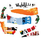
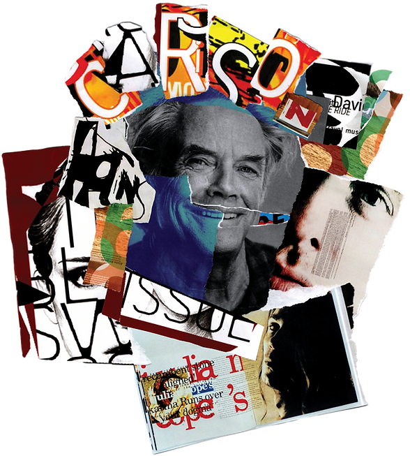
An analogue collage experiment built from printed Carson works, cut, torn, and reassembled by hand. The fragmented portrait reflects his raw, deconstructed approach to design and material.


The title functions as a typographic puzzle, slowing the reader down and forcing a moment of interpretation rather than instant readability.
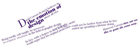
The layout operates across two systems: a guided but off-kilter paragraph structure, and a more experimental L33t Li7e approach used for headings and digital content. What appears chaotic is carefully controlled, with clear hierarchy and directional cues throughout.
Sections of the print layout are intentionally rotated, prompting the reader to physically turn the page and engage with the design rather than passively read it.

Let's get digital


A responsive adaptation of the editorial across mobile, tablet, and desktop, retaining the core design system while adjusting layout, hierarchy, and interaction for digital reading.